nothing drill
Details
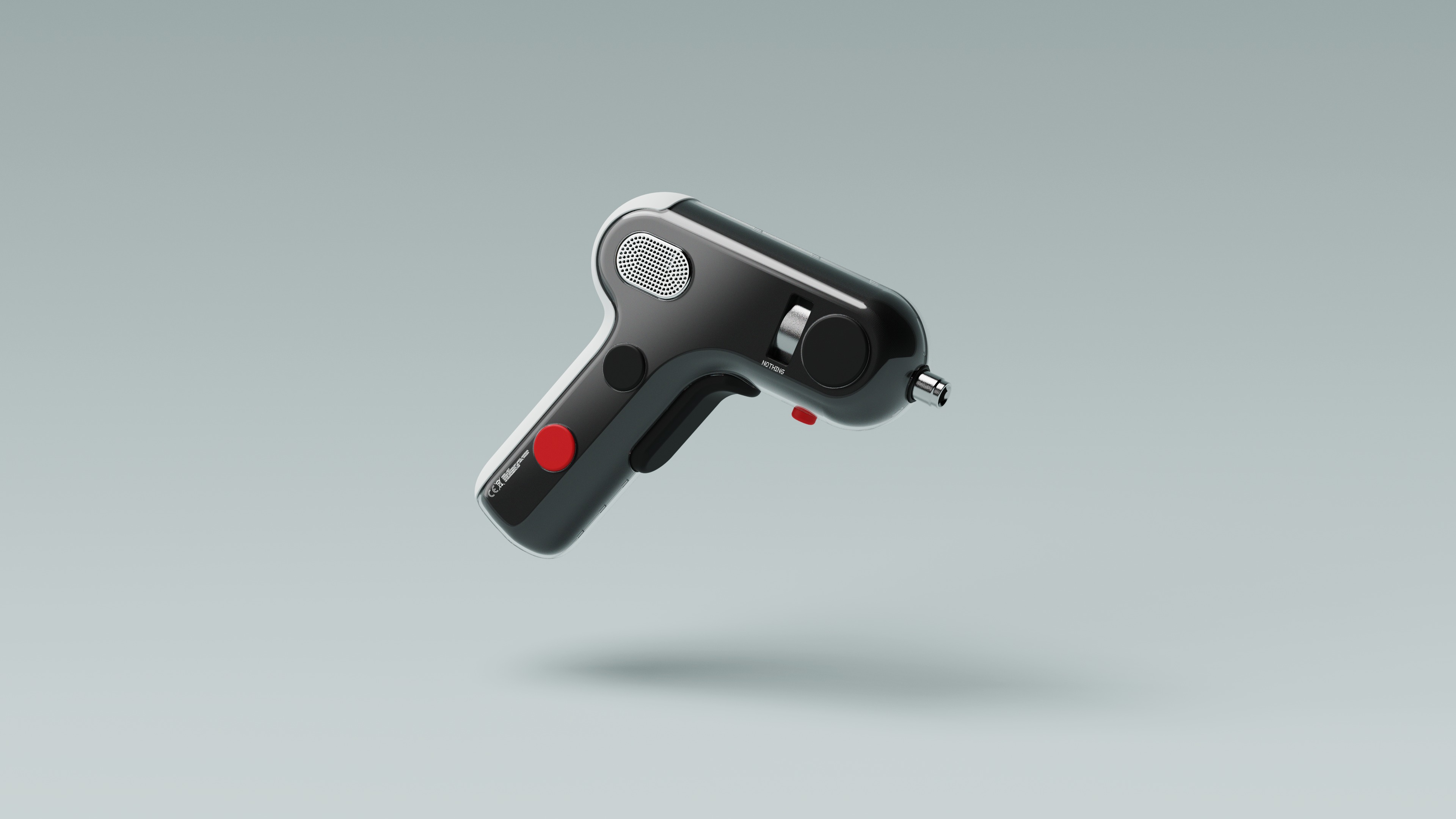
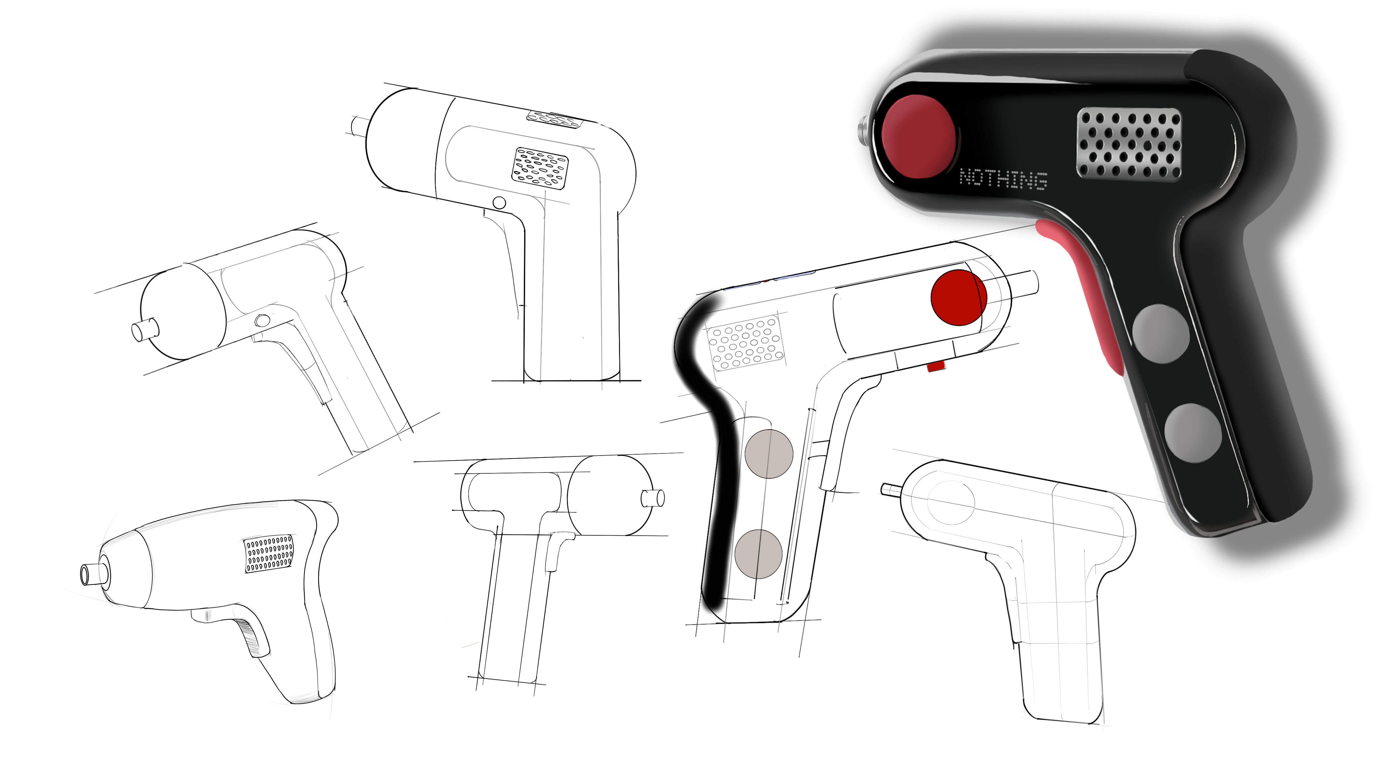
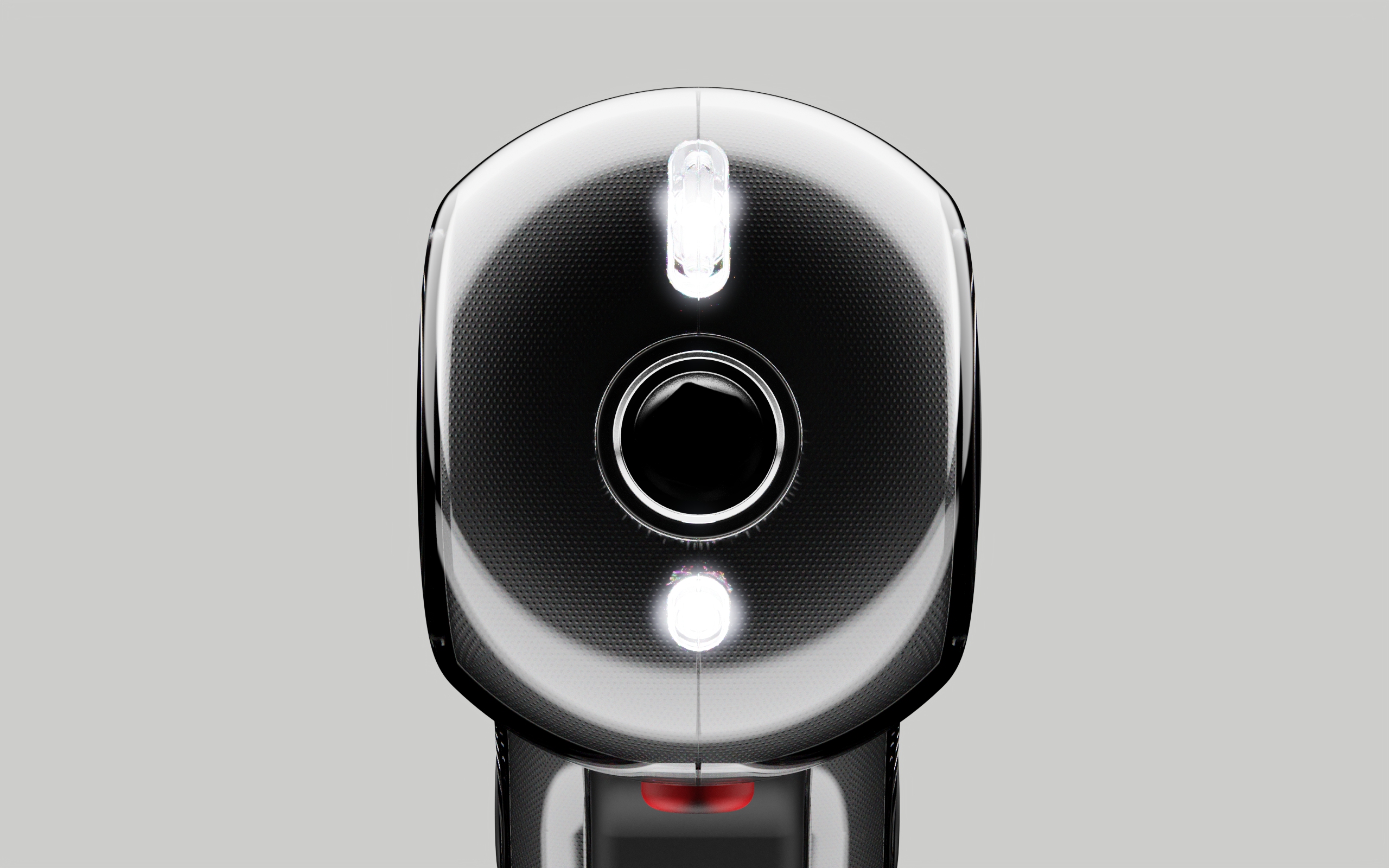
Imagine if Nothing applied their design to a drill.
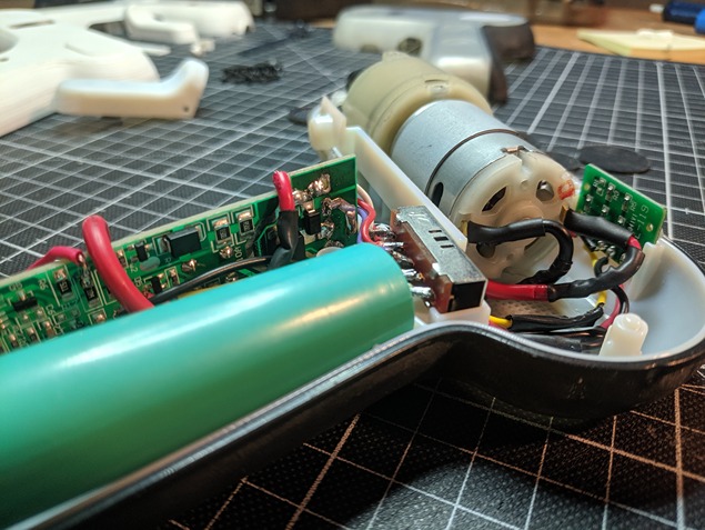
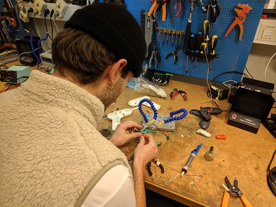
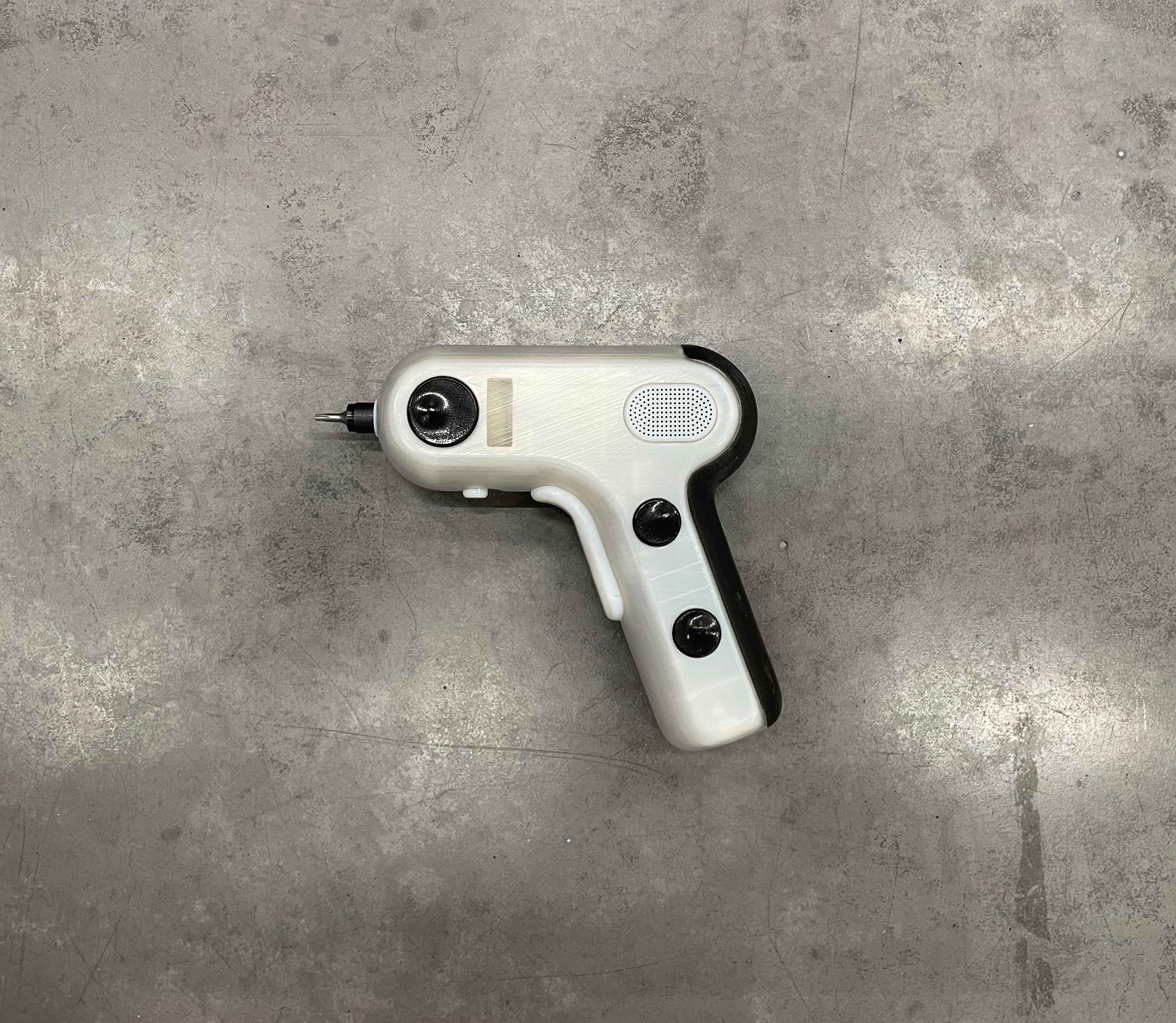
This project stared of as a brand analysis task provided by my university. Getting inspired from the product masters program I elevated the project further. I dove into the challenges of product development and construction. Starting with the guts of an existing electronic screwdriver, I analysed the aesthetics of a brand I think is cool and engineered a tool. The drill corresponds with the design language of Nothing and it works.
University work + self initiative
Note: this is not an official collab
2023
4 weeks
design profile
A scroll through an Instagram company profile is a great
way to get an understanding of their design language.
I would define the Nothing brand as minimalistic,
innovative, transparent, tech-focused and futuristic.
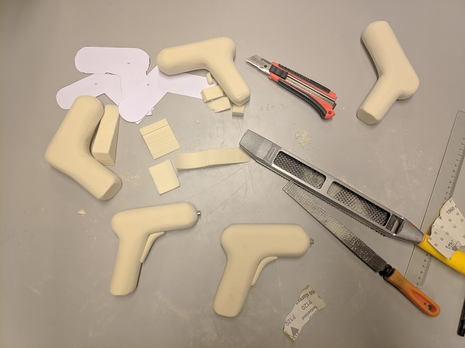
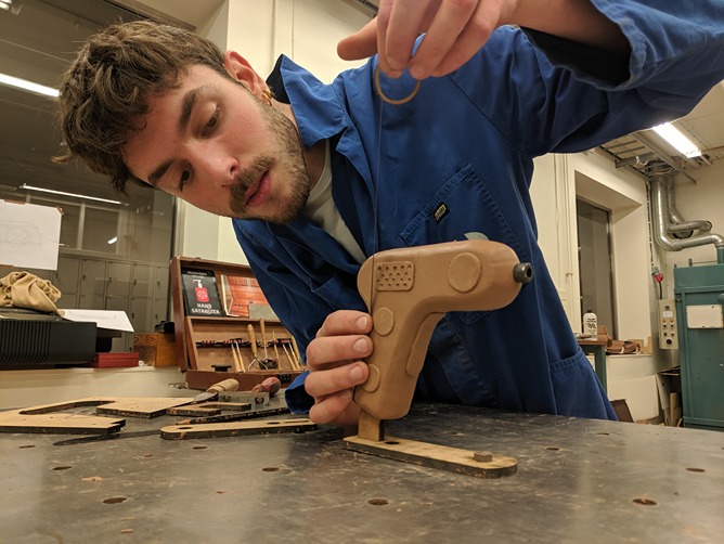
making an actual thing
_
Shout out to my photogenic friend Mohammad. Fantastic drilling!
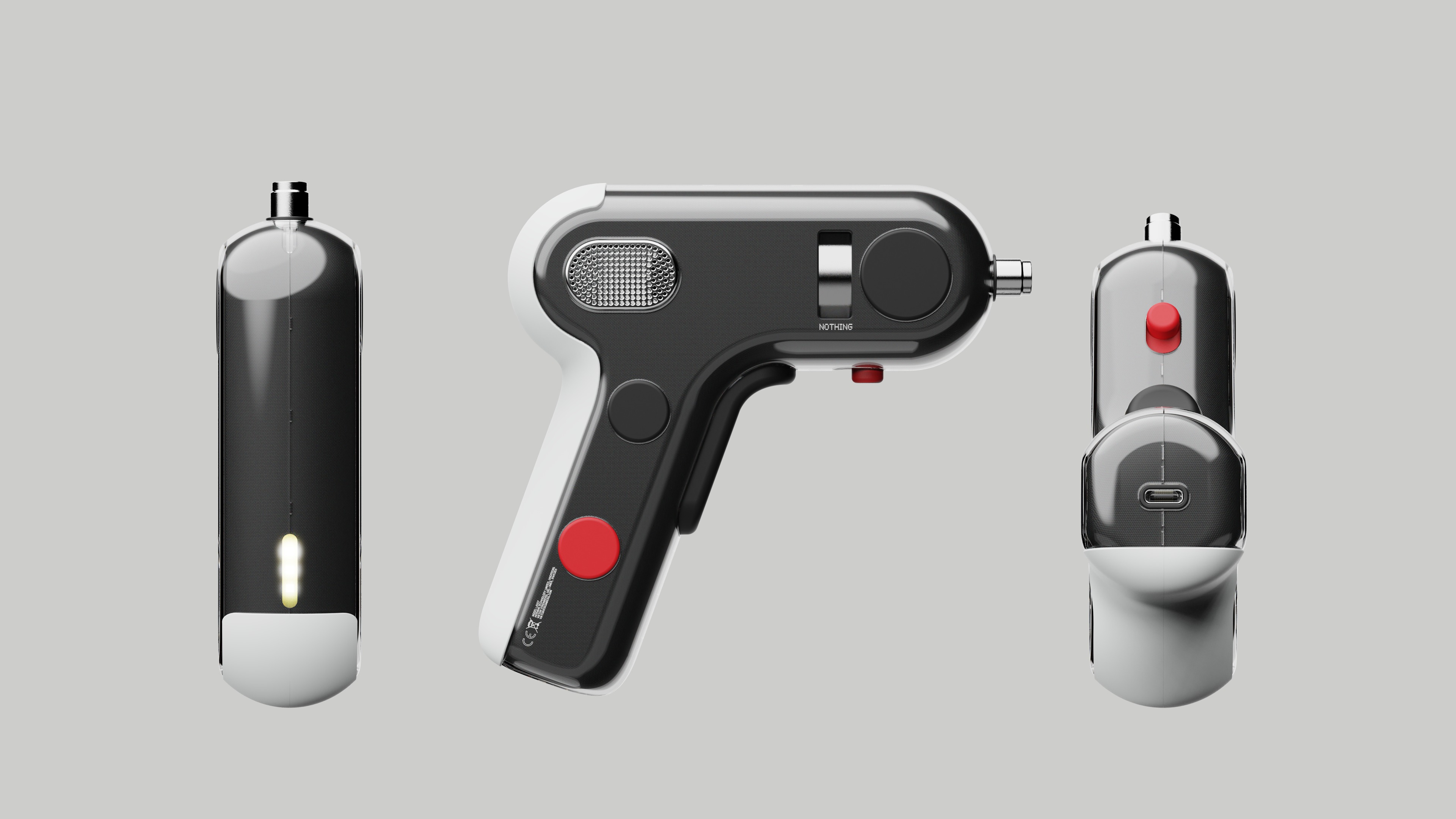
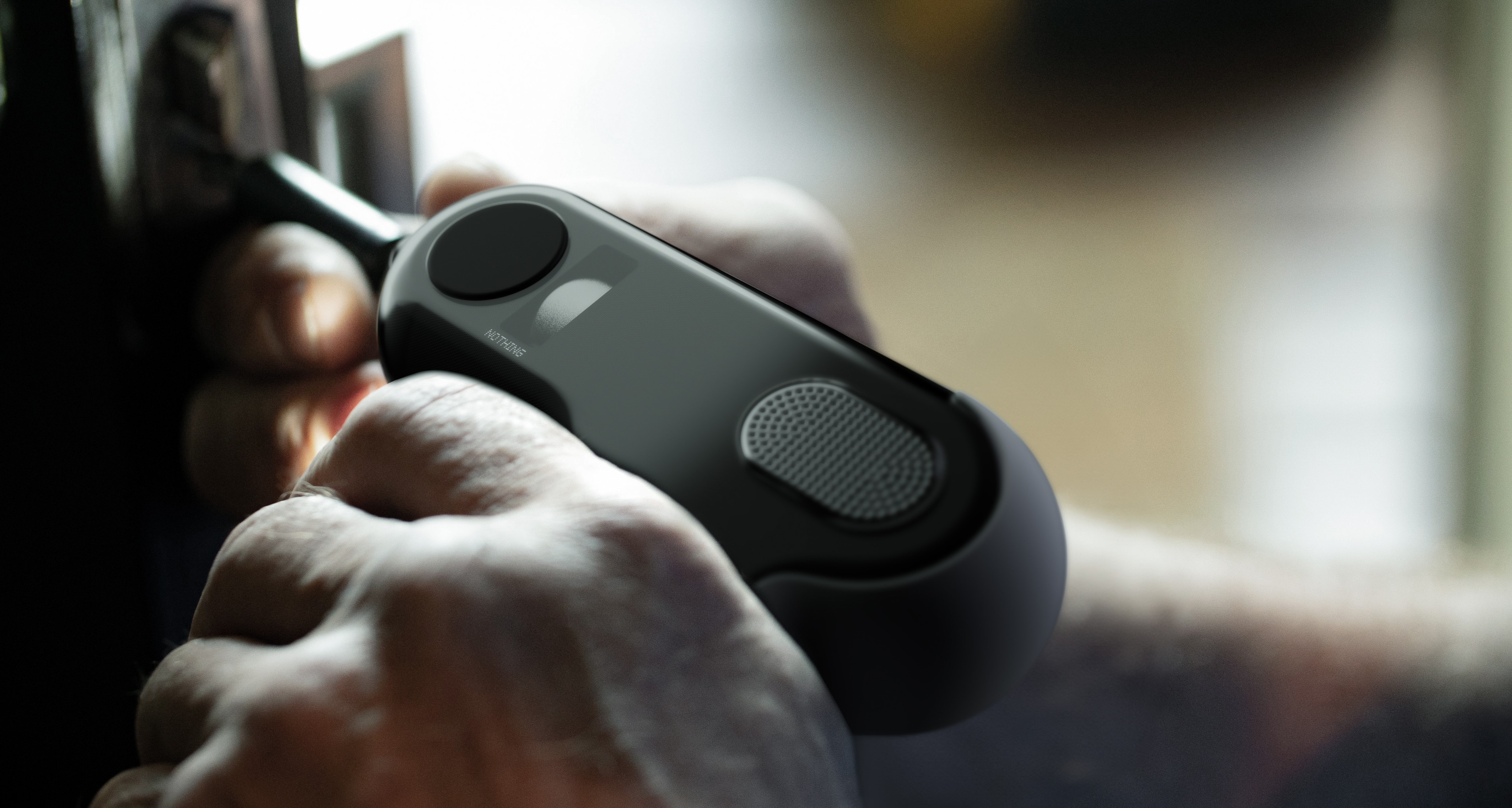
One standout feature of the Nothing drill is its unique placement of the direction button. Placed on the underside, it's conveniently activated using your index finger, allowing for one-handed operations. Equally useful for both left and right-handed users
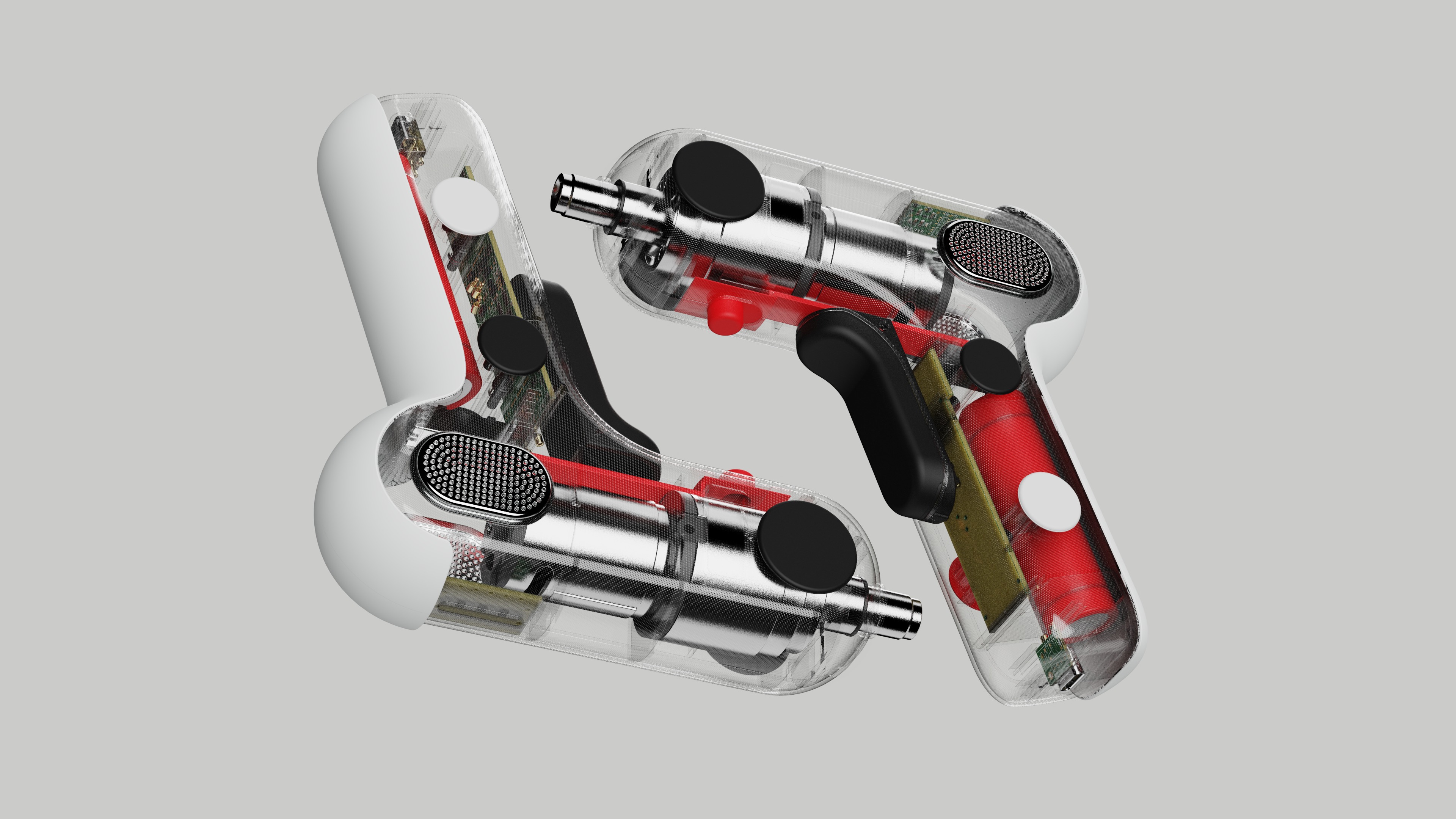
peek inside
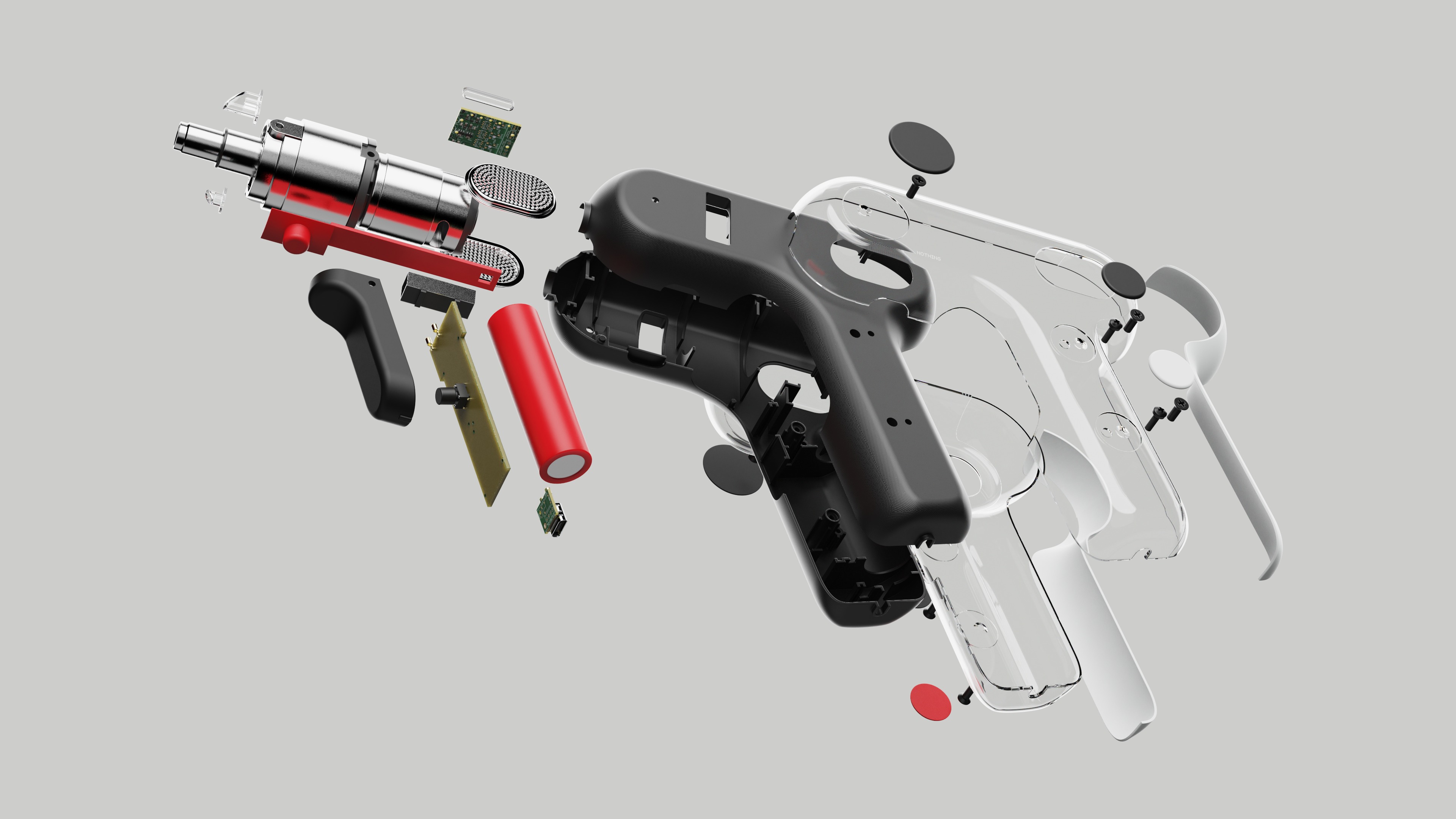
designing transparent
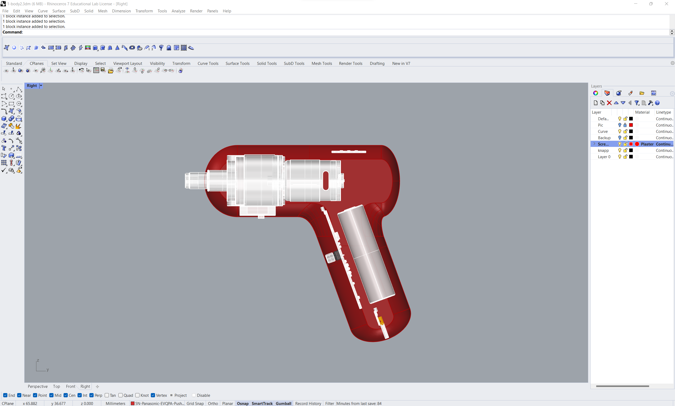
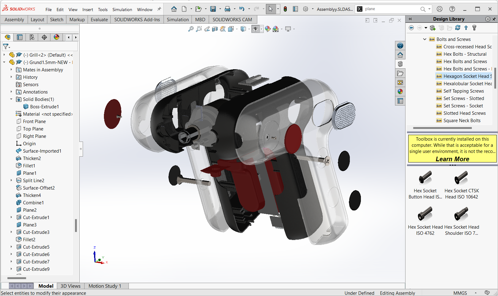
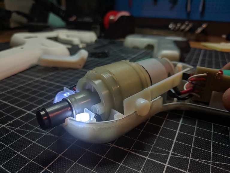
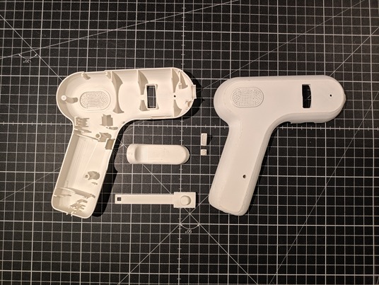
Achieving an appealing design when revealing the interior can be quite a challenge. I had to make some compromises, and ultimately, I chose to showcase only what I believed added to the aesthetics. The motor. The rest of the components remain concealed within the two-layer shell which allows the distinctive Nothing look.
Yeah! Let's drill a desk or something!

